How to structure your counselling website navigation
Once you've worked out which pages your counselling website needs, the next question is how those pages should fit together.
It's easy to spend a lot of time thinking about what information you want to include and forget that visitors also need to be able to find their way around your website easily. You might have all the right pages, but if someone has to hunt around to find your fees, understand how you work or work out how to get in touch, the website isn't doing its job as well as it could.
Your navigation doesn't need to be complicated - most counselling websites work perfectly well with a small number of clearly labelled pages, as long as those pages are organised in a way that makes sense to the people visiting your website.
If you haven't already read my article on The 5 pages every counselling website needs, I'd recommend starting there. Once you have a basic idea of the pages you need, you can start thinking about how to organise them.
Start with a simple menu
For many counselling practices, your main navigation might be as simple as:
Home | About | Counselling | FAQs | Contact
You may need a slightly different structure depending on your practice. For example, if you offer supervision as well as counselling, you might have:
Home | About | Counselling | Supervision | FAQs | Contact
There's no need to add pages simply because you think a website is supposed to have them. Your navigation should reflect the information that is most useful to potential clients, rather than everything you could possibly tell them about your practice.
If you're offering several different services, you might need more pages, but I'd still try to keep the main menu relatively short. Visitors shouldn't have to work their way through a long list of options before they've even started exploring your website.
Use labels that are easy to understand
When you're creating your own website, it can be tempting to use more personal or creative names for your pages. You might prefer "My Story" to "About", for example, or "Working Together" instead of "Services".
There's nothing wrong with doing this if the meaning is obvious, but it's worth remembering that your visitors don't know your website as well as you do. A label such as "About" immediately tells someone what they'll find there, whereas "My Story" might make them wonder whether the page is about your personal life, your journey into counselling or something else entirely.
The same applies to your services. "Counselling" or "Services" is straightforward, while something like "How We Can Work Together" requires the visitor to stop and think about what they're going to find.
You don't need to make your navigation clever, clear is usually better.
Think about what someone wants to know
It can help to put yourself in the position of someone who has never visited your website before.
They may have found you through Google, a recommendation from someone they know or a directory listing. They probably don't know much about you yet, and they may be looking through several therapists' websites before deciding who to contact.
They'll usually want to work out fairly quickly whether you might be able to help them, what you're like as a person, what working with you involves and how they can get in touch.
Your navigation should make it easy for them to find that information without having to think too hard about where it might be.
This is one reason a simple structure works so well. A visitor can start with your homepage, find out a little about you, read about your services, look at the FAQs if they have questions and then contact you when they're ready.
They might not follow that exact order, and that's fine - the important thing is that the information is easy to find wherever they start.
Make your About page easy to find
For many potential clients, your About page will be an important part of deciding whether they feel comfortable contacting you.
Choosing a therapist is different from choosing many other professional services. Someone isn't just comparing qualifications or prices; they're also trying to get a sense of whether they could imagine talking to you about things that may be difficult or personal.
For that reason, I'd usually keep your About page in the main navigation rather than hiding it away somewhere else.
Someone might read your homepage and services page and then want to know more about you before they decide to get in touch. If the About page is easy to find, they can do that without having to search for it.
Make Contact easy to find too
The other page I'd always keep prominent is your Contact page. It sounds obvious, but it's surprisingly easy for websites to make the contact process feel like an afterthought. If someone has reached the point where they're considering getting in touch, you don't want them to have to search around for an email address or work out where they're supposed to go next.
Keep your Contact page in the main navigation and consider using clear calls to action elsewhere on your website too. Depending on how you work, this might be something like "Get in touch", "Arrange an introductory call" or "Enquire about counselling".
It's also helpful to explain what happens after someone contacts you. If you normally respond within two working days, for example, telling people that can make the process feel a little less uncertain.
Don't try to put every page in your menu
One of the easiest ways to make website navigation unnecessarily complicated is to treat the main menu as a list of every page on your website.
You might have separate pages about anxiety, depression, trauma, relationships, stress, self-esteem and bereavement, as well as pages about your therapeutic approach, qualifications, location, online counselling and other services. Before long, you can end up with a menu that takes up half the screen. That doesn't mean those pages shouldn't exist. It just means they don't necessarily all need to be in your main navigation.
For example, if you have separate pages about different issues you work with, you could introduce those on your Services page and link to them from there. Someone who wants to know more about anxiety can follow that link, while someone who isn't looking for that information doesn't have to navigate past it.
This can make the website feel much simpler without removing useful information.
Be careful with dropdown menus
Dropdown menus can be useful when you have several related pages, but they're not always necessary for a counselling website.
If you offer individual counselling, for example, you probably don't need a dropdown containing several different pages unless there's a genuine reason for having them separately.
If you do offer several distinct services, a dropdown can make sense. You might have a "Services" heading with individual counselling, couples counselling and supervision underneath it.
The important thing is to use dropdowns because they make the website easier to organise, rather than simply because you have a lot of pages.
Remember that people will use your website on their phones
You should check your navigation on a mobile phone as well as a laptop or desktop computer. Most website platforms will automatically create a mobile menu, but it's still worth testing it yourself. Open the menu, look at the available options and try to find the pages a potential client is most likely to want. Are the links easy to tap? Is it obvious how to get back to the main menu? Can you find your Contact page without having to work through a long list?
You don't need to understand the technical side of mobile navigation. Just use your website as though you were a potential client and see whether anything feels awkward or confusing.
Use links within your pages too
Your main navigation isn't the only way visitors should be able to move around your website. Links within your content can help guide people towards the next piece of information that's relevant to them, without making your main menu more complicated.
For example, at the end of your About page, you might invite someone to find out more about how you work and link through to your Services page. At the end of your Services page, you might point people towards your FAQs or Contact page. This creates a natural journey through your website while keeping the main navigation simple.
What about your blog or resources?
If you have a blog or resource section, you may want to include it in your main navigation, particularly if you're regularly publishing articles that you want potential clients to find. You could call it "Blog", "Resources" or "Articles", depending on what feels right for your website.
You don't need to list individual articles in your main navigation, though. As your resource section grows, you can organise your articles within it and link between related posts. For example, someone reading an article about managing anxiety might also be interested in one about coping with stress or dealing with difficult thoughts. Links between related articles make it easier for visitors to explore your content without adding more options to your main menu.
What if you're not sure whether you need another page?
When you're planning your website, you may find yourself wondering whether a particular piece of information deserves its own page. There's no single answer to this, but a useful question to ask is whether the information is substantial enough to be useful as a standalone page and whether a potential client is likely to look for it.
If the answer is yes, it may make sense to create a page for it. If you're only creating the page because you feel that a "proper" website should have one, it's probably worth thinking about whether it's actually necessary.
You can always add pages later. Your website doesn't need to contain everything when you first launch, and there's nothing wrong with starting with a relatively small site and expanding it as your practice develops.
A simple structure is often enough
For many counselling practices, I'd start with something along the lines of:
Home
About
Counselling / Services
FAQs
Contact
You might then add other pages where there's a clear reason for doing so, such as supervision, workshops or a separate page for a particular service.
The exact structure will depend on your practice, but the principle is fairly simple: make it easy for someone who has never visited your website before to understand what you offer, find out more about you and work out what to do next.
You don't need to create a complicated website to achieve that.
Final thoughts
Good navigation is really about making your website easier to use. The person visiting your site shouldn't have to understand how your practice is organised before they can find the information they're looking for.
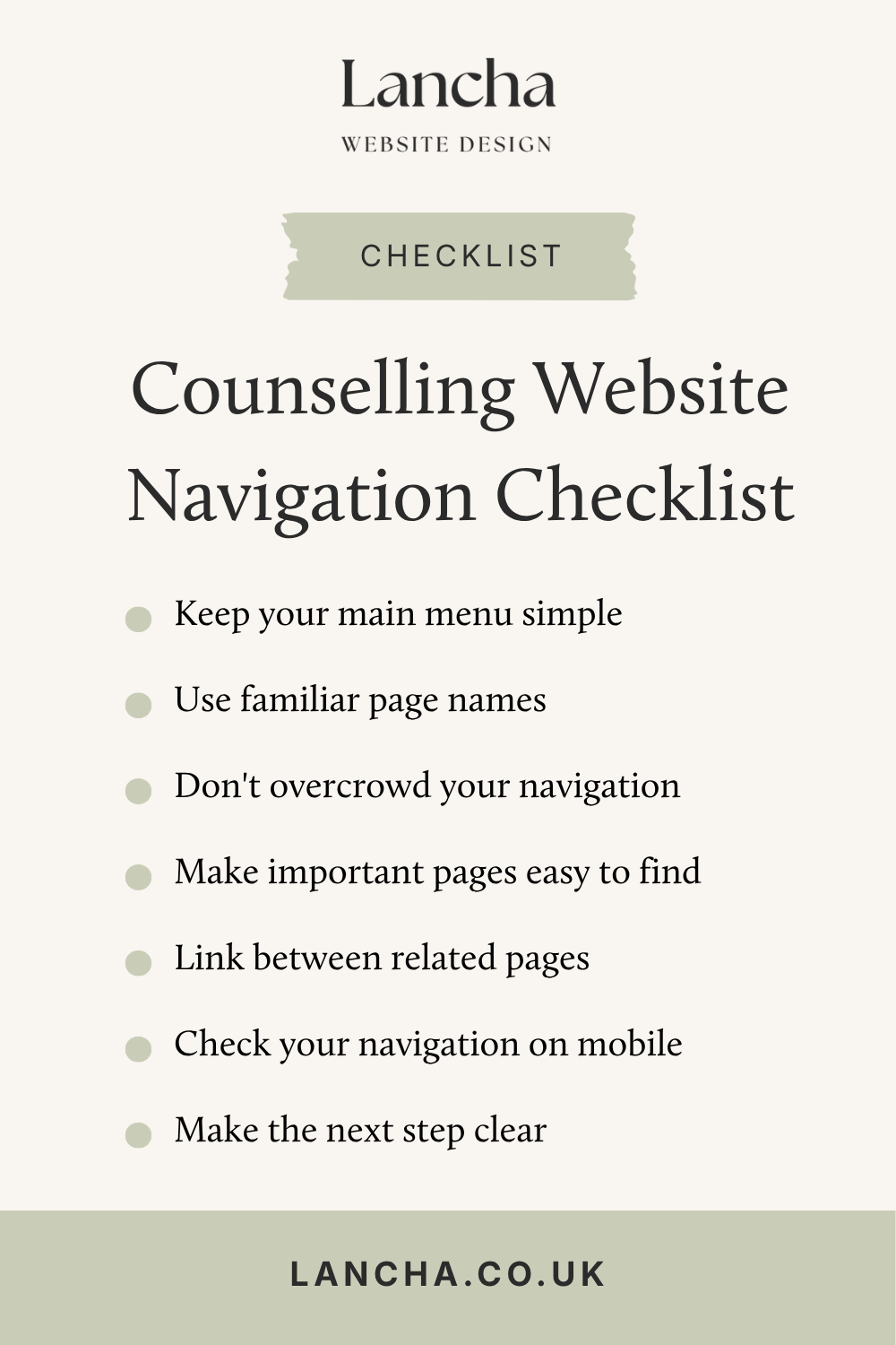
Keep your main menu relatively short, use labels that are easy to understand and make important pages such as About and Contact easy to find. If you have lots of additional information, look for ways to organise it within your pages rather than putting everything into the main navigation.
And don't worry too much about getting it absolutely perfect. Start with the information your potential clients are most likely to need and build from there.
If you're still at the planning stage and you're not sure which pages you need or what information belongs on each one, my Website Content Planning Guide for Therapists can help. It takes you through the planning process with practical prompts and exercises, so you can work out what your website needs before you start writing.